


Scape Swanston
New School of Thought
Scape Living
Swanston Street
Activation
Complete
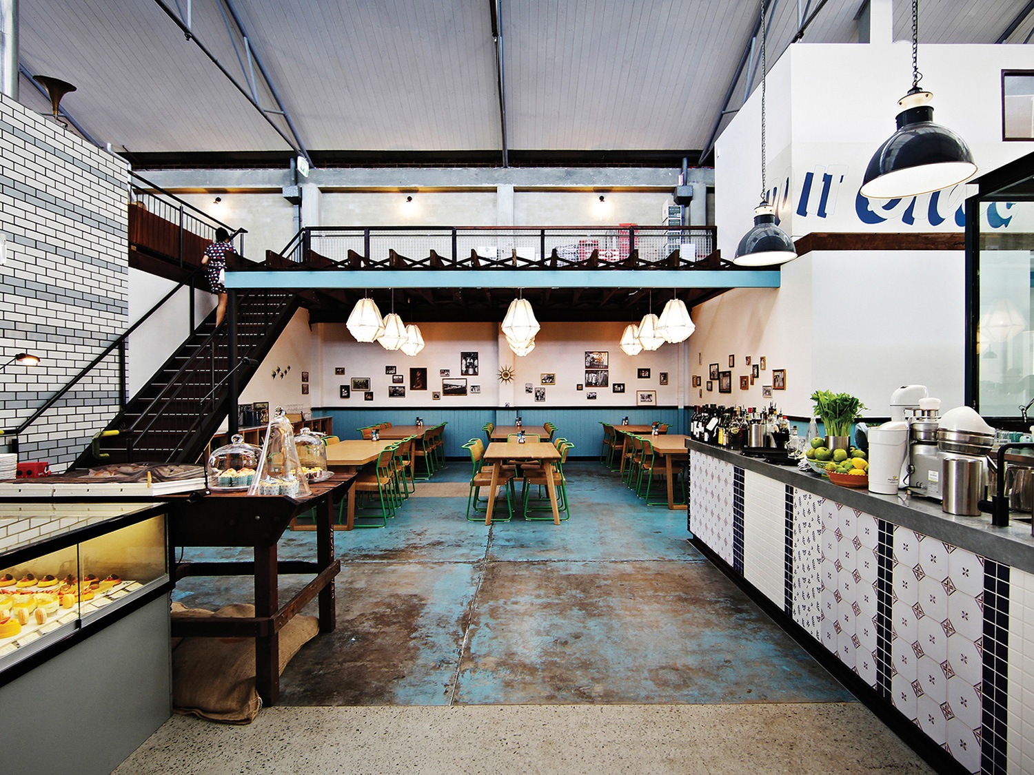
Penny Lane; supplied by client
Winner/Bronze pin, Best Design Awards 2018, ‘Spatial / Colour Award’
High Commendation, Dulux Colour Awards 2018, Best Commercial Interior (Public and Hospitality)
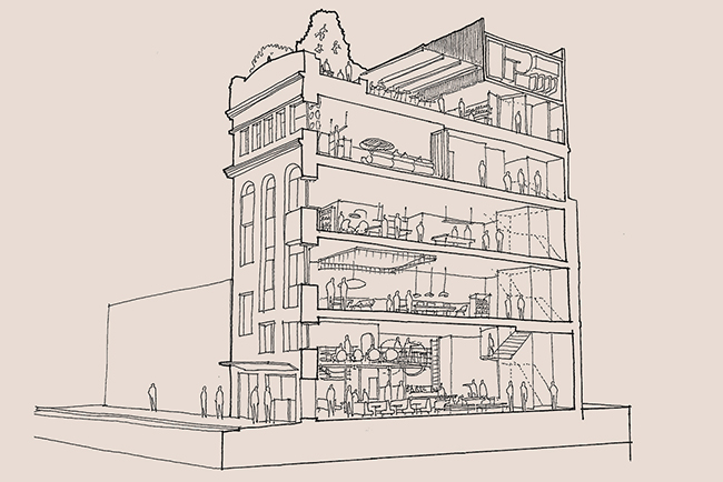
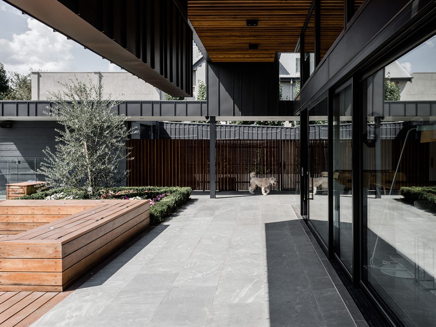
New student accommodation sited to connect with RMIT’s developing New Academic Street precinct.
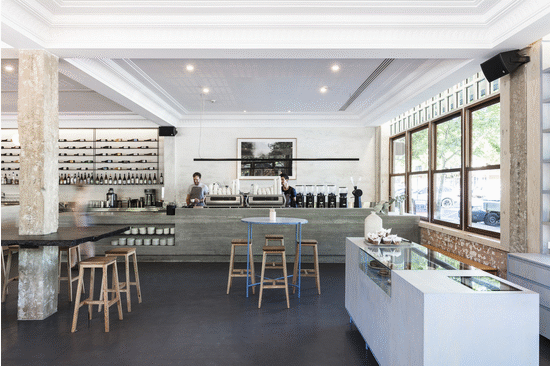
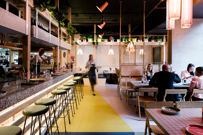
Scape Swanston Street elevates students’ daily living to a new level. Alongside London-based Ab Rogers Design, who developed the highly functional private rooms, we were engaged to realise the Scape experience across all communal areas. Distinct communal zones have been designed to support, inspire and engage. From multifunctional social spaces to serene studio havens, Swanston Street is an ideal place to connect, collaborate and learn.
Colour was fundamental to marrying our concept, based on colour theory, with Scape’s identity pillars: ‘clean, but not cold’, ‘proudly pop’, ‘singular, not eclectic’, ‘be the pink sheep’ and ‘surprisingly daring’. These translated to a scheme that balances colour with neutral space in a bold, kaleidoscopic palette.
Focusing on maximum impact of key colourful and graphic moments, we sliced through white and raw finishes with swathes of colour to define specific-use areas with flexible, informal boundaries. Calm, deep blue envelops one corner as a cinema; a sharp wedge of green ceiling signifies a shift in energy for study zones.
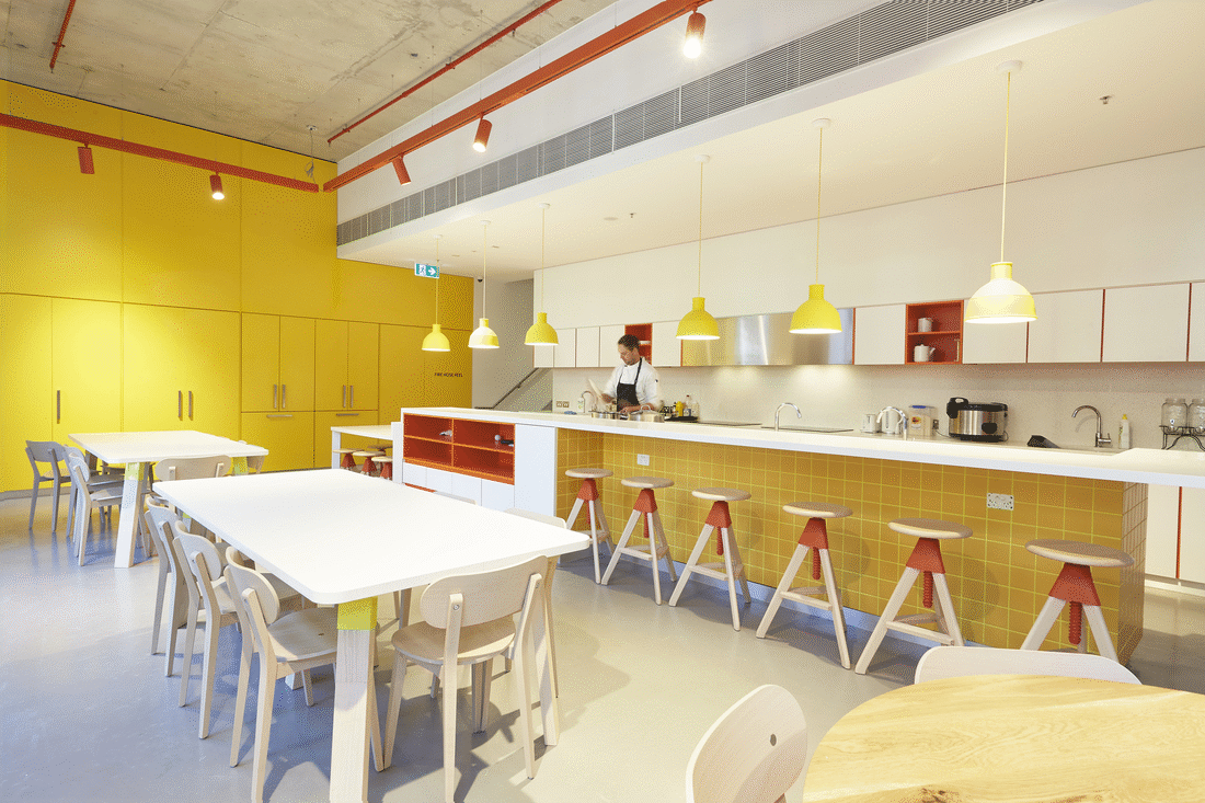
Other, smaller zones are demarcated and given life with colour ‘reveals’. In The Workshop, green and yellow tones were chosen for quiet mindfulness. Inset zones reveal immersive study nooks that offer calming respite from frenetic social activity. Yellow carries through into The Mess Hall, where joinery conceals orange shelving – an energetic, visual surprise to inspire creativity and lead into red punctuations.
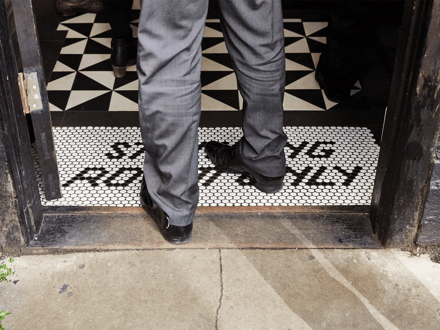
Red and pink tones are the thematic base of The Clubhouse, reception and vertical core of the building. Signifying warmth and ‘nurture’, appropriate to this home away from home, these welcoming tones encourage interaction and attract attention at street level. The reception entry is by laneway, so this distinctive Melbourne vernacular, with its graffiti and riotous mash-up of colours and textures, is acknowledged by a big, bold lick of red on the wide, curling central staircase set against the raw concrete of soaring walls.
Other projects are in progress at several sites across Sydney and Brisbane, to develop amenities that complement some of the country’s most progressive tertiary education institutions.